reading_notes
Read: 08 - More CSS Layout:
Positioning elements
Building blocks:
CSS treats each HTML element as if it is in its own box. This box will either be a block-level box or an inline box. Block-level boxes start on a new line and act as the main building blocks of any layout, while inline boxes flow between surrounding text.
Controlling the Position of Elements:

- Use box offset to indicate where a box should be positioned.
- Fixed Positioning: a form of absolute positioning that positions the element in relation to the browser window. when a user scrolls down the page, it stays in the exact same place.
- Floating Elements: allows you to take that element out of normal flow and position it to the far left or right of a containing box.
- z-index: allows you to control which box appears on top.
- clear: allows you to say that no element (within the same containing element) should touch the left or right hand sides of a box.
Creating Multi-Column Layouts with Floats:
- width: sets the width of the columns.
- float: positions the columns next to each other.
- margin: creates a gabs between columns.
Screen Sizes:
Different visitors to your site will have different sized screens that show different amounts of information, so your design needs to be able to work on a range of different sized screens.
Screen Resolution:
Resolution refers to the number of dots a screen shows per inch. *the higher the resolution, the smaller the text appears.
Page Sizes:
web designers often create pages of around 960-1000 pixels wide. *many designs let the user know that site is about 570- 600 pixels top.

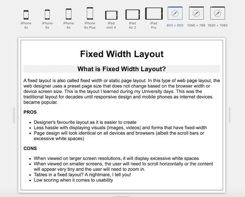
Fixed Width Layout:

Some popular websites using Fixed Width Layout:
- Facebook.com
- YouTube.com
- LinkedIn.com
- witter.com Most of these had their page widths set in the 980 px range.
Liquid Layouts:
Advantages:
- This layout can be more user-friendly if used correctly as it is flexible based on users’ device and browser
- The correct amount of white space can be maintained between the contents or columns across all the devices
- On a larger screen, fluid width layout will make use of the larger
screen real estate so users can view the content with minimal scrolling. - The elastic layout is ideal if using a lot of textual content.
Disadvantages:
- Designers have less control over the users’ views when using the fluid width layout
- Unlike in the case of the fixed width layout, custom media dimensions or width limiters (like min-width and max-width) will need to be used when displaying visual media like images or videos.
- Width limiters are not supported on some of the older browsers which could impact the display of the web page.
Some popular websites using Fluid Width Layout:
- Google.com
- Wikipedia.com
- Amazon.com
Layout Grids:
Grids set consistent proportions and spaces between items which helps to create a professional looking design.
CSS Frameworks:
providing the code for common tasks, such as creating layout grids, styling forms, creating printer-friendly versions of pages and so on.
Advantages:
- They save you from repeatedly writing code for the same tasks.
- They will have been tested across different browser versions
(which helps avoid browser bugs).
Disadvantages:
- They often require that you use class names in your HTML code that only control the presentation of the page (rather than describe its content).
- In order to satisfy a wide variety of needs, they often contain more code than you need for your particular web page (commonly referred to as code “bloat”).
Multiple Style Sheets @import:
There are two ways to add multiple style sheets to a page:
- Your HTML page can link to one style sheet and that stylesheet can use the @import rule to import other style sheets.
2 In HTML you can use a separate
<link>element for each style sheet.
